Sense Bank

Design Development
Sense Bank
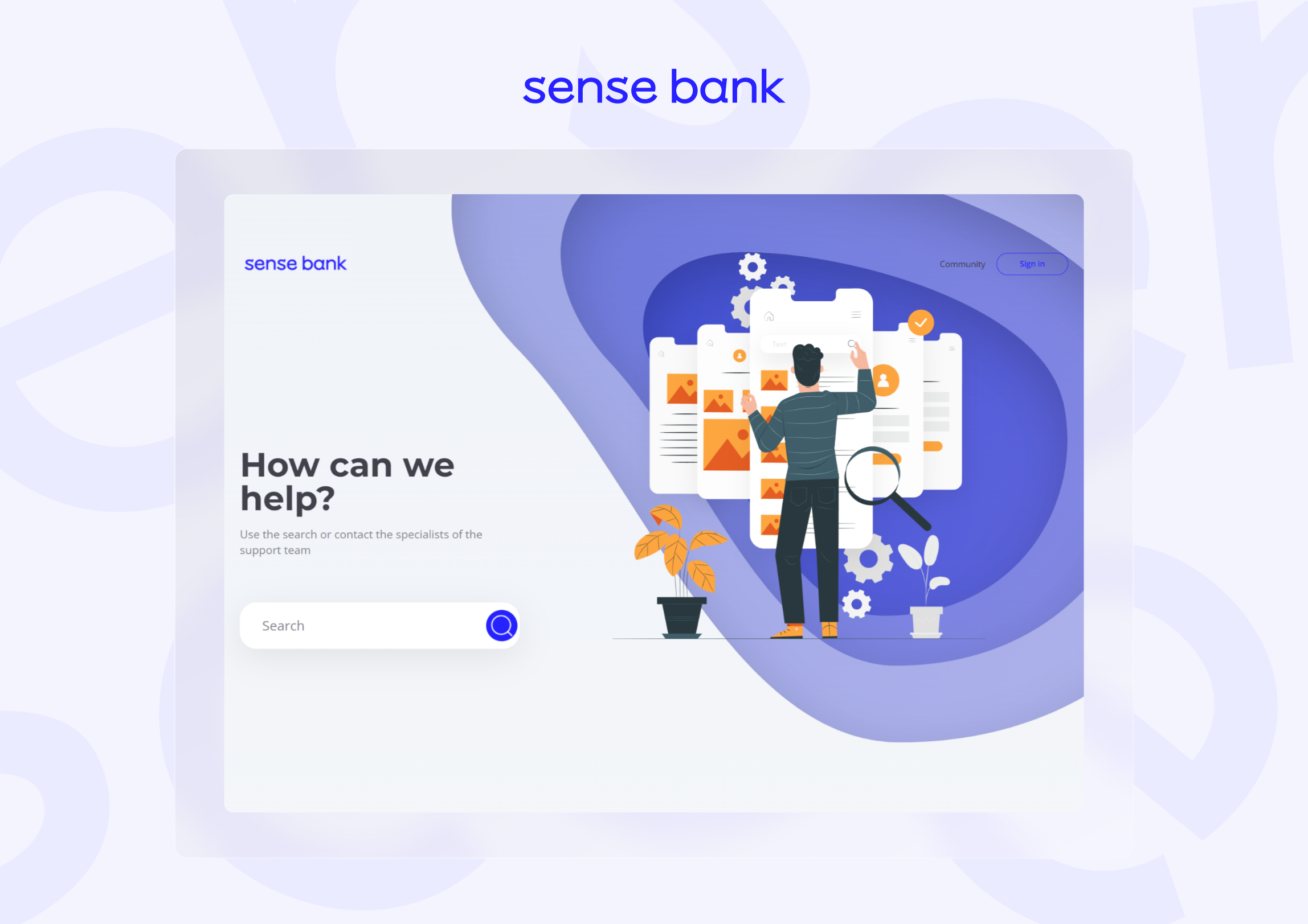
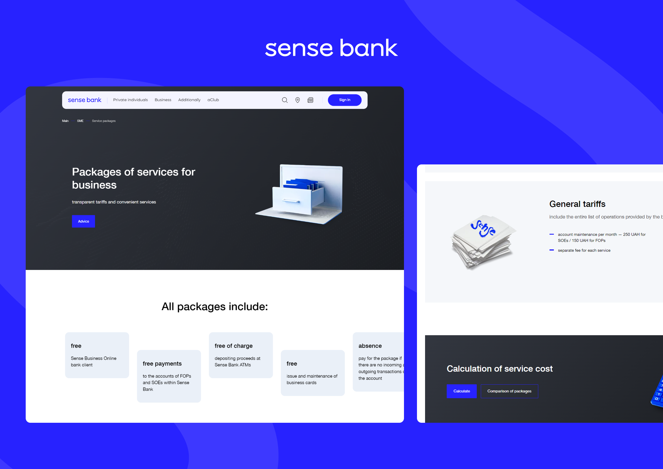
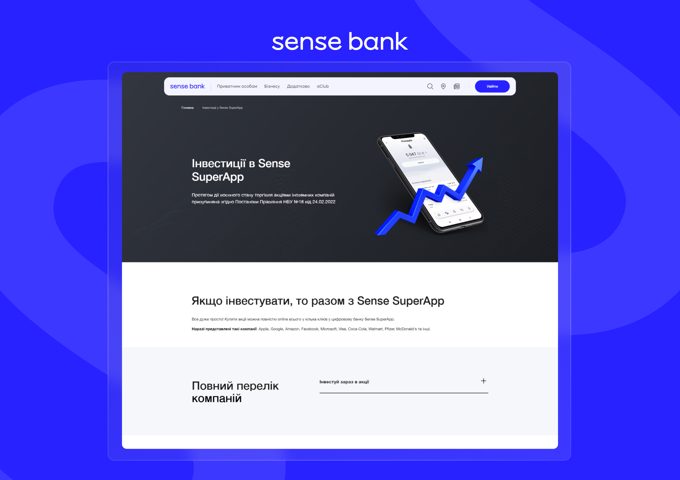
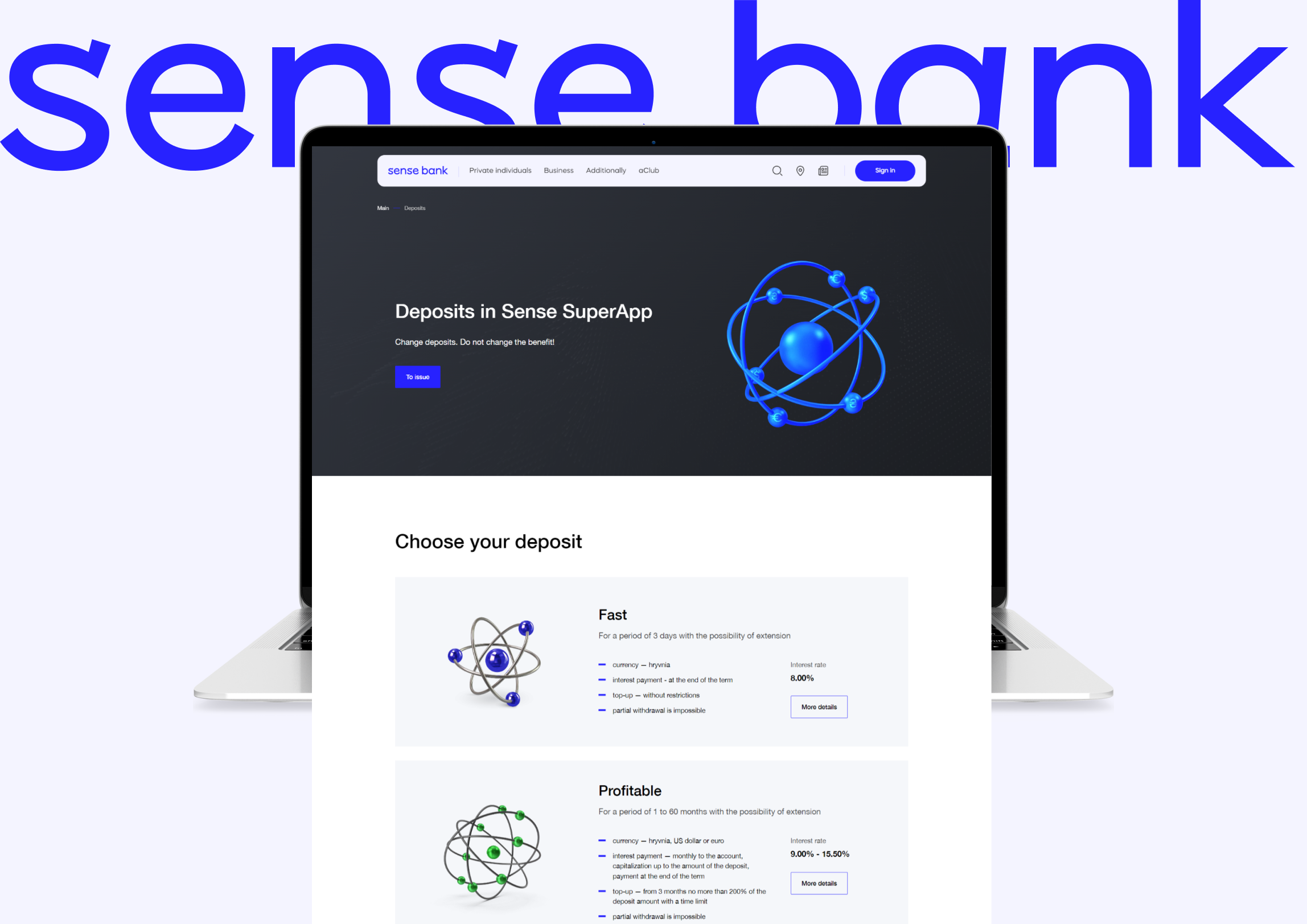
Supporting and finalizing a bank's website is an interesting project.
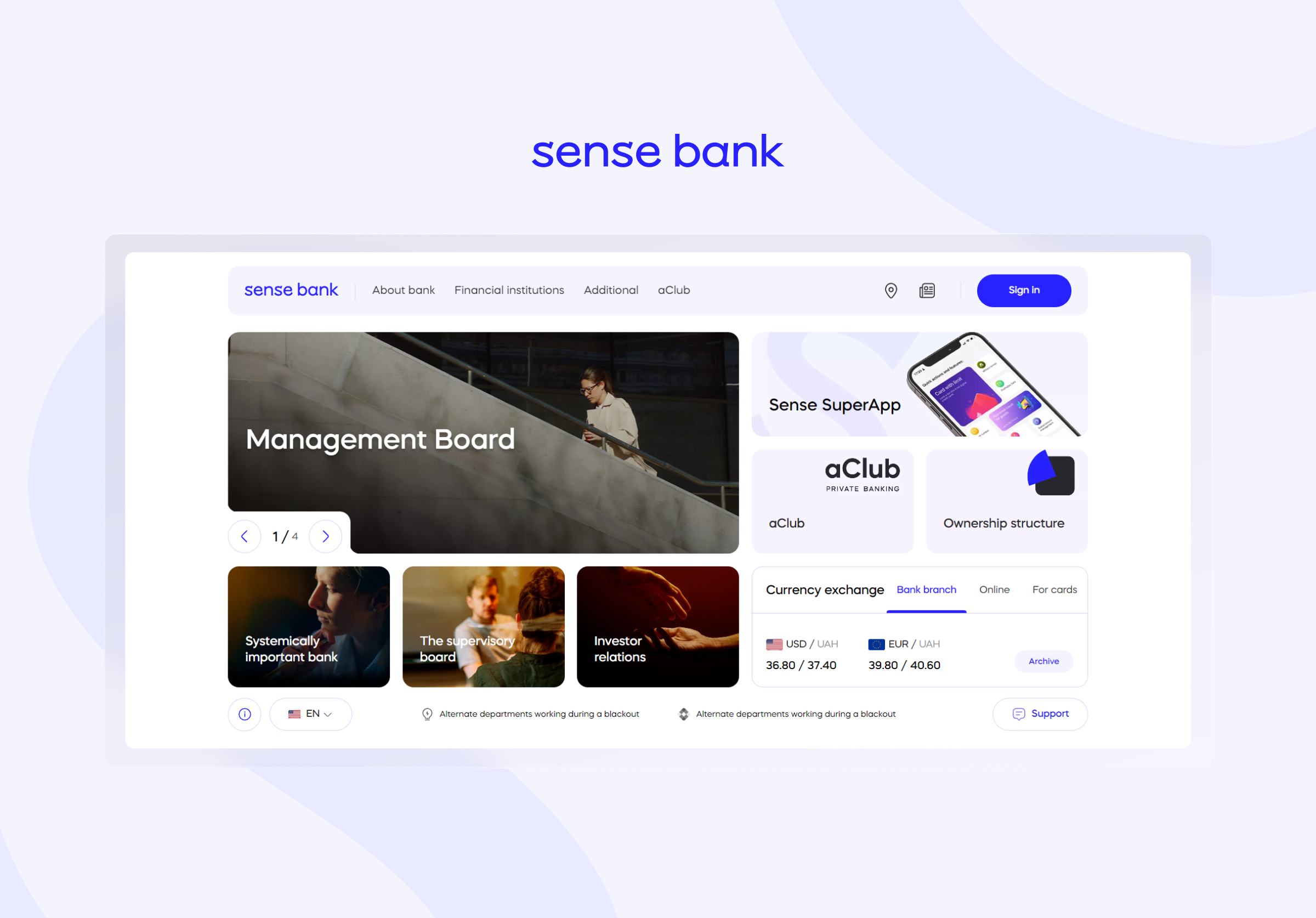
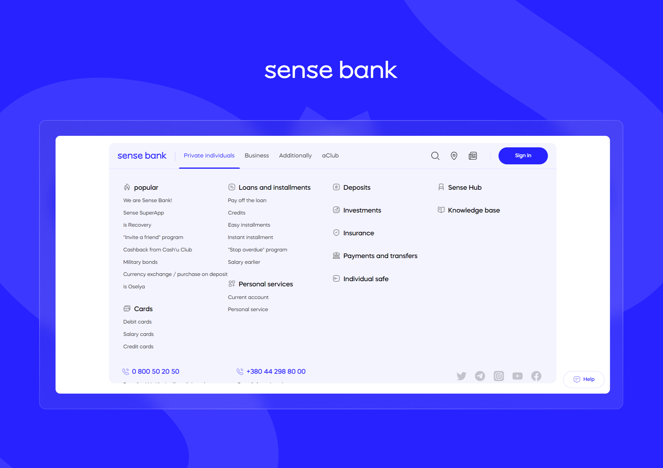
Such a project may involve both a complete redesign of the site and the creation of mobile applications. Today, we will tell you about website development for a bank, based on our experience of working with Sense Bank. We will talk about the stages of work, key tasks and results of the work.
Stages of Rebranding a Website for a Bank

When our team worked on supporting Sense Bank's website, the key task was rebranding:

  1. The stage of analysing the company's current identity. At this stage, we communicated with the customers and analysed their materials. Some UX design sketches and some ideas were already ready. Our team prepared several sketches and potential mock-ups based on the available information, after which we started a step-by-step redesign.
  2. Interaction phase. When it comes to rebranding, tight communication between the contractor and the client is important. The Sense Bank team gave clear TORs for each item, which made the development process easier, because the client knows what he wants to get from the final product.
  3. Selection of specialists and formation of a team to work with. After all the tasks and the future of the project became clear, it was necessary to gather a team that would take over the implementation of the project. For rebranding of Sense Bank website, the following specialists were involved: UX Senior UI Middle / Frontend Middle x2 / Frontend Junior / Backend Middle / Backend Junior / Backend Senior / QA DevOps / Project Manager / SEO Team Lead / SEO Specialist.
  4. Analyses. Every stage of work in such a project is analysed. For example, when our team received TOR for the next block of work, we worked on ideas, made sketches, consulted with the customer, received feedback. Then we analysed all weaknesses and strengths, proposed ideas and created quality solutions.
  5. Design features. We encountered an interesting aspect of the work — adaptation of the main page of the site for the resolution of 2K and 4K monitors. Yes, these monitor resolutions are not so common, but this is the essence of quality design. We need to take into account all categories of users and their characteristics.
  6. Design and visual identity. This stage involves redesigning the site, including the look and feel and visual elements such as the logo, colours and fonts to reflect the new brand identity.
  7. Work on SEO. It is important to remember that rebranding work should not affect user traffic in any way. When rebranding, it is important to retain existing SEO traffic by redirecting old URLs to new ones and ensuring that the metadata is correct.
  8. Working with updates. After the testing and release phases of the product, it is important to respond to bugs, even minor ones, in a timely manner.

Features of Website Development for a Bank and Its Functionality

Do not forget about the distinctive features of creating a website for the bank. It differs from a classic shop or marketplace. And here are a few requirements that must be adhered to in such work:

  1. Do not forget about regulations. Banks are subject to strict regulatory requirements and legislation such as KYC (Know Your Customer), AML (Anti-Money Laundering), GDPR (General Data Protection Regulation) and others.
  2. Interactive calculator and other useful widgets. It can be a loan calculator, deposit interest calculator and more. It all depends on the range of bank services.
  3. Integration of analytics systems. It enables the bank to monitor the actions of customers, as well as to analyse popular operations and requests.
  4. Content management. A content management system (CMS) facilitates updating information on the website, including news, rates and services.
  5. Compliance with applicable laws. You need to make sure that the site and the bank are fully compliant with the legislation, and your actions will not violate it. This applies not only to Ukraine, but also to projects from abroad.

Conclusions

A banking website is an important tool. It not only helps to interact with customers, but also improves their experience and attracts new visitors. The site should be not only functional, but also clear, informative, convenient. It should attract users and provide them with solutions to their problems. If you need help creating a website or rebranding it, the Brander team is ready to get to work.

Technology

Frontend

Vue.js
Vue.js

Backend

PHP
PHP
Next
Ready to work together
What are you interested in?
One file only.
5 MB limit.
Allowed types: pdf, doc, docx, odt, ods.
5 / 5 (87 votes)