Adding a search bar to your online store is an important thing. Without the search option, the conversion rate will be many times lower. According to statistics, a well-integrated search engine helps to increase conversion rates by more than 70%.

As for the number of users who use the search bar in online stores or marketplaces, the figure is 20%. But pharmacies, hardware stores, and bookshops can already boast a figure of 50% and higher. Hence, we conclude that search is important. But it is not only important to have it, but also to set it up correctly.
Different Types of Product Search
Add several product search options at once. Don't limit yourself to a classic catalogue and a simple search bar.
First, you need to conduct analytics on current product items and structure them.
After that, you need to collect your visitors' searches and structure them into the most popular categories: brand, model, type of item.
Once the list of queries is collected, segment it. Roughly speaking, we make an analogue of Google in its search engine on the site.
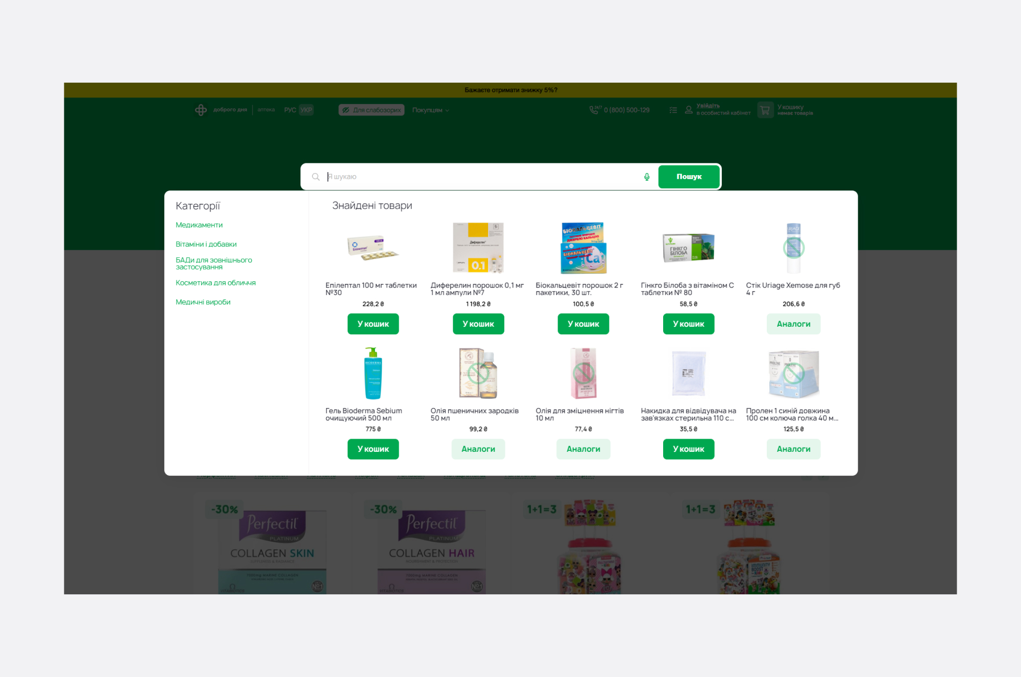
When a customer starts to enter "cross....", they will be presented with the top most popular queries.
The second option is product and item filters. Here, everything depends on the specifics of your online store and product categories. They should be exactly in line.
If we are talking about clothes, the filters can be as follows:
- seasonality;
- size;
- gender (children/girls/men);
- type of use (sports, casual, tourist);
- price filter;
- sorting by brand;
- dimensionality (it is advisable to include several types of dimensional grids at once).
This will make it easier for people to navigate the search. They will narrow down the range of products to those that are suitable, which will increase the chance of buying in your store.
Placement of the Search Bar on the Product Catalogue Page
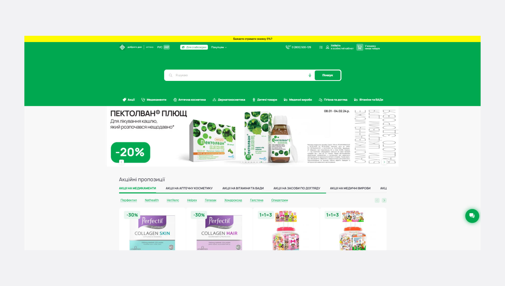
The search bar should look organic and ergonomic in the interface. It should always be in a visible place, but not interfere with the potential buyer.
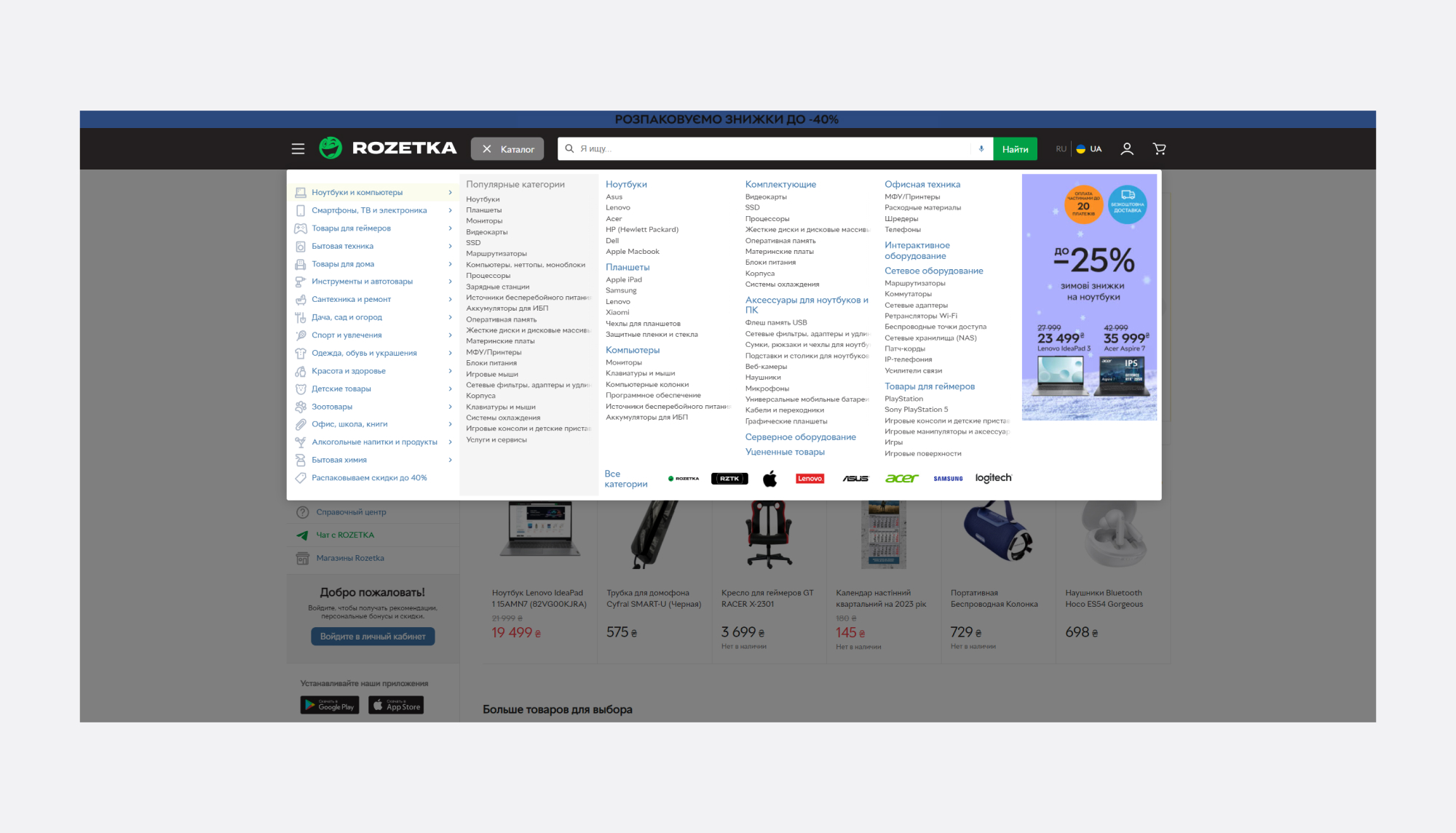
No matter how well you have thought out the catalogue system, the user may need the search bar and should see it instantly. It should stand out from the rest of the elements.
An example of a popular marketplace. The overall colour palette is consistent, the search bar is immediately visible (a play of contrasts), but it does not look too intrusive.
Regularly Update the List of Products Available for Search
An obvious point, but it is often forgotten.
We advise, no, we strongly recommend, not to forget about updating and replenishing catalogues. If you have new items in stock, they should be searchable through the search engine of your store or marketplace.
What’s the Bottom Line?
When creating an online store, you need to take into account many factors, because each of them matters and affects sales, customer experience, and loyalty to your product.
And you shouldn't forget about the search bar. An ergonomic, functional search bar = purchase = increased company revenue.


