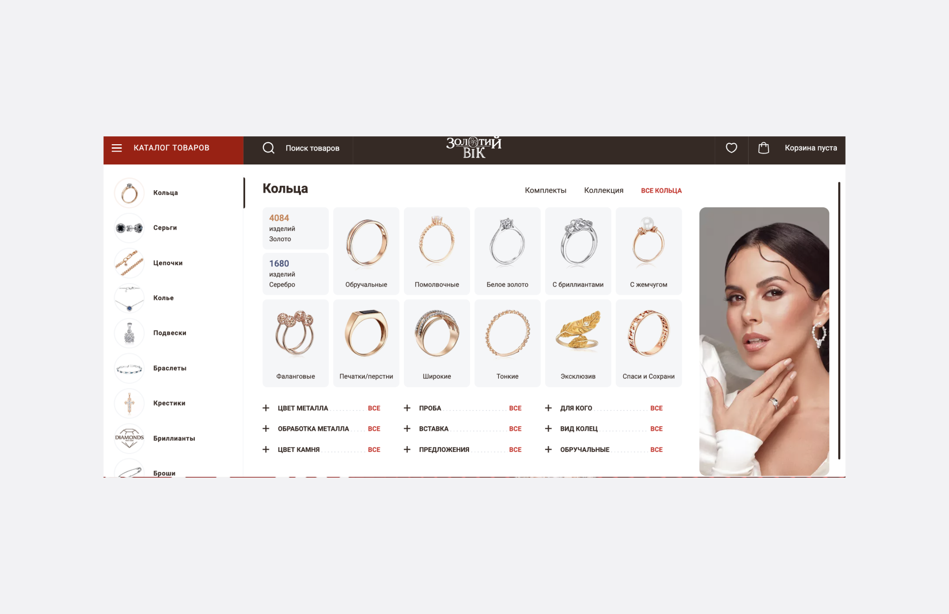
Today we are going to talk about a product catalogue for your online store. On the one hand, everything is clear. The catalogue should be convenient, clear, and ergonomic. On the other hand, remember how many times you've come across a website where "everything is very interesting, but nothing is clear". This is because the owners of such online stores often get carried away with creativity, forgetting about practicality. Today we will remind you of five key parameters for creating not only a high-quality but also an effective catalogue.
Correct Structure of the Product Catalogue
The first thing to consider is the structure of the catalogue. It may differ depending on the specifics of your products. But it must meet two key criteria: logicality and intuitive clarity.
All products in the catalogue should be clearly and logically structured. There should be a main category that includes subcategories.
For example: "Clothes — socks — women's socks — women's sports socks".
This is the simplest example, as they say, "on the fingers", but it clearly shows the structure of the goods. If you have not just an online store, but a whole marketplace, you can and should include sorting by brand, manufacturer, and other criteria.
Clear Category and Subcategory Names
Naming is very important. The name of a subcategory/category should fully correspond to its content. If you have a category called "Intel processors", it should contain only processors of this brand. There can be no processors from other manufacturers or other products from this manufacturer.
If you have a product category with many different items that cannot be classified as existing, what should you do? Choose an appropriate name.
Avoid the names "Other", "Rest", "Small items", etc. It's better to call this category "Accessories for personal computers or laptops", "Accessories and headset", etc.
Easy Navigation Through the Product Catalogue
The catalogue should be in a prominent place. The user should immediately see the catalogue and be able to use it. You can place it next to or below the search bar.

And yes, don't forget about the ease of switching between different product categories. This means that the user, having opened the tab with motherboards, should not lose sight of the general catalogue. The catalogue should remain in the same place as in the previous window and look similar. This way, your potential customers can "walk around" the store as long as possible and find everything they need.
Organize Products by Functionality and Purpose
Let's continue with the example of computer components. For example, you can create a large category "PCs and accessories" where all product groups will be located: from motherboards to power connectors. Thus, when opening the category, the user will be taken to a conditional "PC builder" and will be able to collect the necessary products in the basket and order.
Use Product Images to Improve Your Catalogue
Images are important. But it is also important to remember about their relevance. Continuing with the topic of PCs and components, there are two versions of a processor: with a cooler (boxed version) and just a processor.
For these options, you need to take several different photos. For the "boxed" version, you need to add not just a photo of the packaging, but also of what is included in the package:
- the processor itself;
- thermal paste (if it is present/if not, it should be indicated in the specifications);
- papers and all kinds of "waste paper", stickers, etc;
- a cooler and mounts (if available).
It may seem like just 2-3 additional illustrations, but they can make the experience of interacting with your store much more pleasant.
Just imagine a situation where your customer orders a boxed version, waits for it, it arrives, he starts assembling the PC and then realizes that the thermal paste is not included, or the cooler mounts do not fit the dimensions.
Conclusions
The catalogue acts as a kind of guide for users, making the search for goods easier and faster. The faster the visitor finds the required product, the better. This increases the chances that their shopping experience will be positive, and they will be more likely to make a purchase.
Don't forget about the needs of your customers. Always put yourself in their shoes and create a competent, high-quality catalogue. It will work for you for a long time and only attract new customers.


