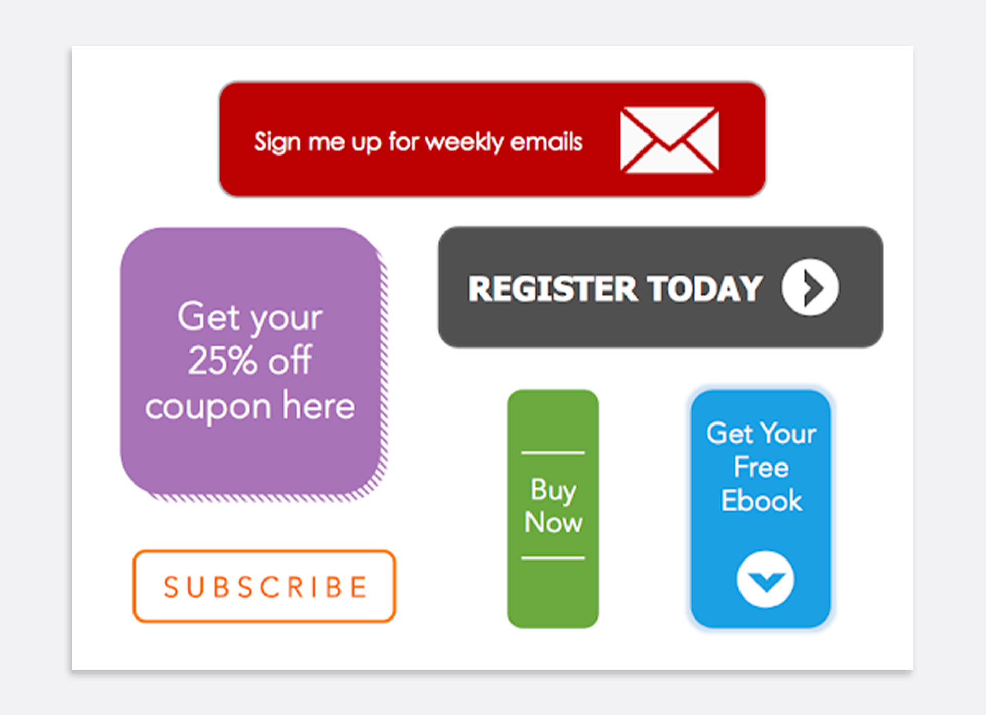
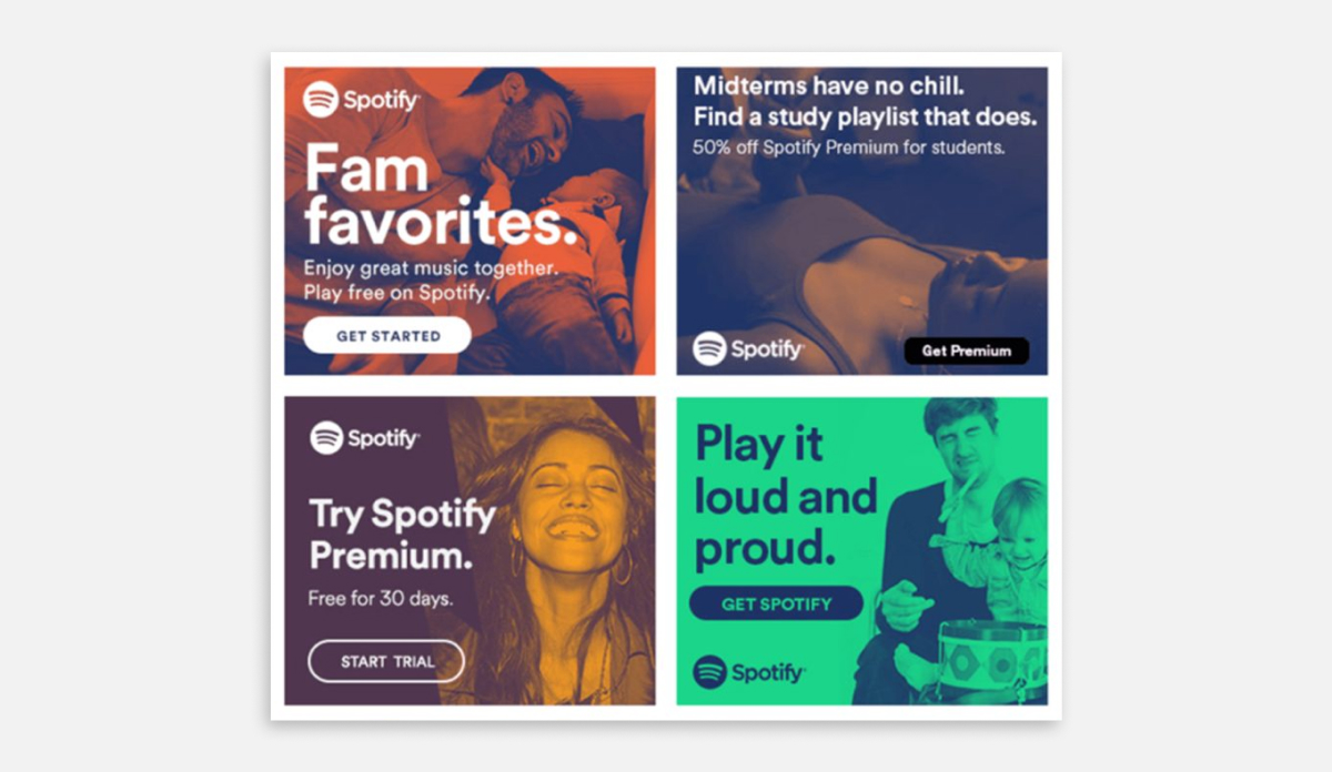
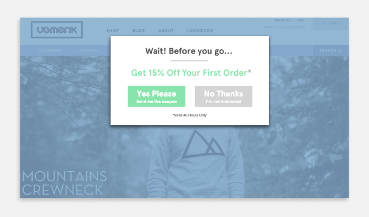
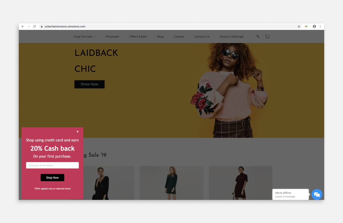
Call to Action (CTA) is a short phrase on and around a prominent button in a strategic place in a banner.
The classic "Buy" and "Subscribe", the tricky "Get a discount", and the creative "Immerse yourself in emotions" — that's it. There are also many smaller calls to action, such as leaving a review or sharing with friends.

Why You Need a Call-To-Action and How to Make It Effective
Call to action is the final stage of the classic AIDA model, which describes the algorithm for making a purchase decision as attention-interest-desire-action. Clicking on the CTA button is an action that takes the customer to the next stage of the sales funnel.
For you, CTAs are a way to increase conversions and fight objections. For the client, it helps them make a purchase decision.
Create an effective call to action:
- Write the text;
- Draw a design;
- Place it correctly;
- Improve it to perfection.
And to make it work, you need to take into account the specifics of the company and its customers:
- Business area;
- Customer journey;
- Features of the target audience.
This means that it's not enough to make your button huge, red, and flashing to get it clicked with the desired frequency. Although there is a possibility of this happening. If you've collected statistics, conducted analytics, and are 100% sure that your target audience needs this kind of call, then go for it!
The most important thing in a CTA is harmony. The call to action should perfectly complete the entire marketing concept: match the products, price, engagement channels, and, of course, the customer's needs. Moreover, the needs, both in general and right now, at a specific stage of studying your offer.
As with other marketing tools, you need to experiment with CTAs, changing them depending on the reaction of visitors.
There is no universal formula, but you can find the perfect one for your project.
Text for Call-To-Action: Personal, Specific, Unobtrusive
Two basic rules of CTA:
- The call-to-action should motivate and clearly explain what will happen after the click;
- Call-to-action is a text not only on the button, but also next to it in a window, on a banner, etc.
There are different ways to make a call-to-action effective, for example:
- First-person. A visitor makes a decision by clicking a button. So why not play on this? At the very least, formulate the call to action as the end of the phrase "I want to..." to activate a trial period, choose a date, get a discount. The text next to it should also be in the first person. "Collect your bonuses" and "Collect my bonuses" are two big differences. The second option works better.
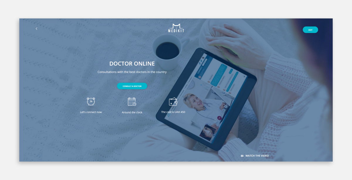
- Exactly. Call-to-actions, more than anything else, are subject to Murphy's Law: if a call-to-action can be misunderstood, it will be misunderstood. If you write on the button instead of simply "Download", more detailed "Get a free tutorial" or "Start a free month" instead of "Subscribe", you will remove one of the main objections. Also, numbers work great here, for example, "10 lectures for 500 hryvnias". Of course, a detailed explanation won't always fit on the button itself, but it will fit next to it in big letters.
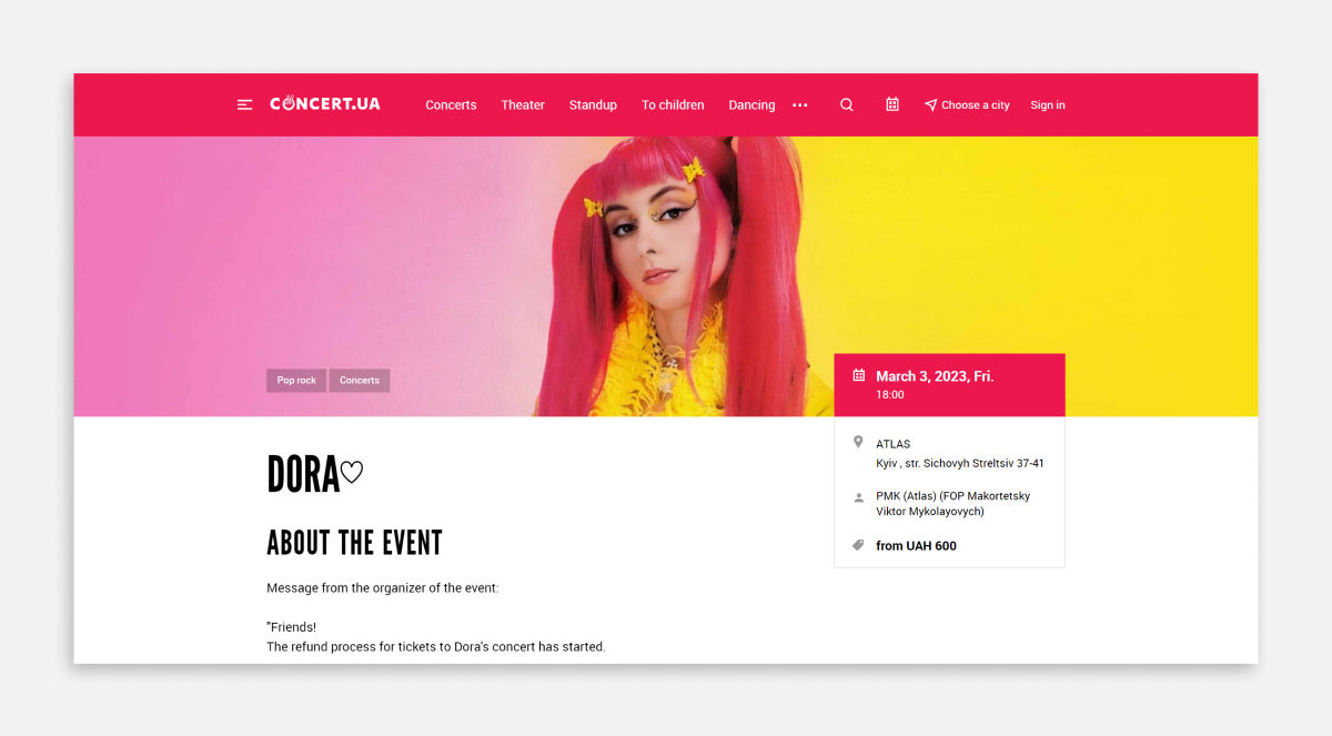
- Non-violent approach. It's better to remove the word "buy" from CTAs that the user sees immediately when they go to the site, and even push it further away. Especially if you are selling something where you need to study the characteristics (and this includes both dresses and machine tools) or subscription services. In the first case, you should offer a consultation, and in the second, a trial period. The exception to this rule is quick solutions to specific problems. For example, food delivery or concert tickets are needed right now. If a person has already decided to buy, don't make their life difficult.
- Remember the familiar. A marketing tool used, for example, in shopping carts and confirmation emails. The idea is to tell the customer what they bought, how much it cost, and when it will arrive. It also works at the sales stage. So what if you have already written the benefits on the banner or even listed all 4 screens above. Just remind them again in the box right next to the button!
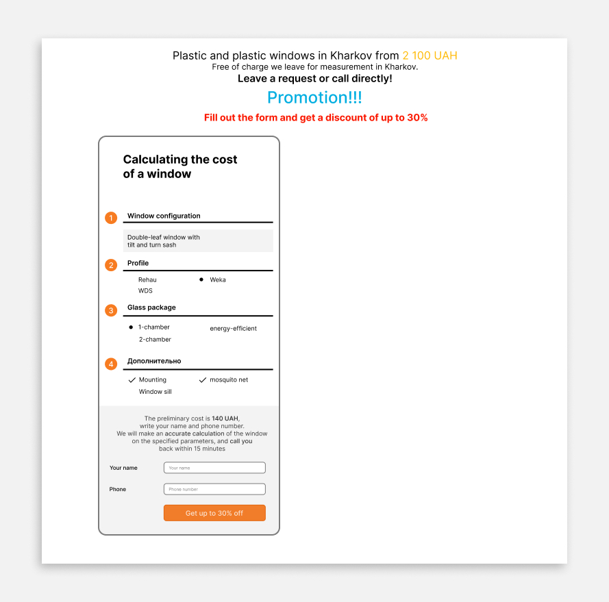
- Try it without leaving the checkout. No one likes to waste time on registration, even if it's free. Especially if the visitor is still not sure whether they need this service at all. In this case, the call-to-action should offer to "touch" your offer. Calculate an approximate estimate, take a test and try the basic functions of the web application.
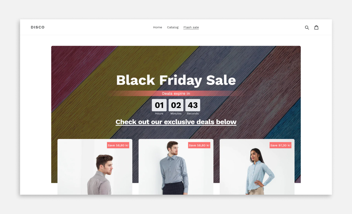
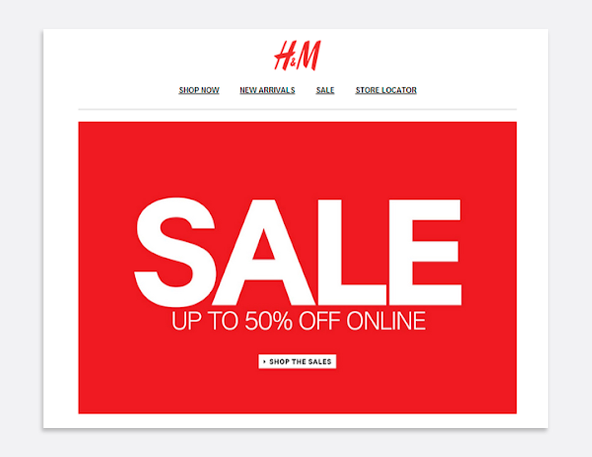
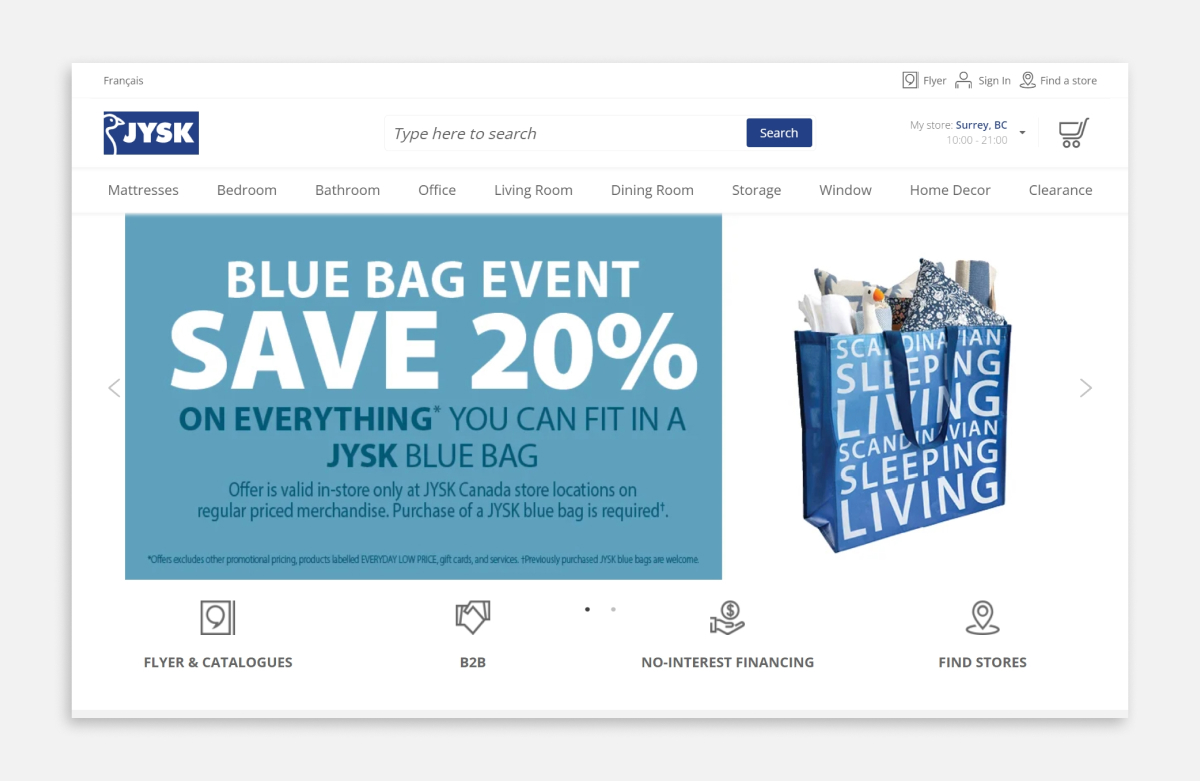
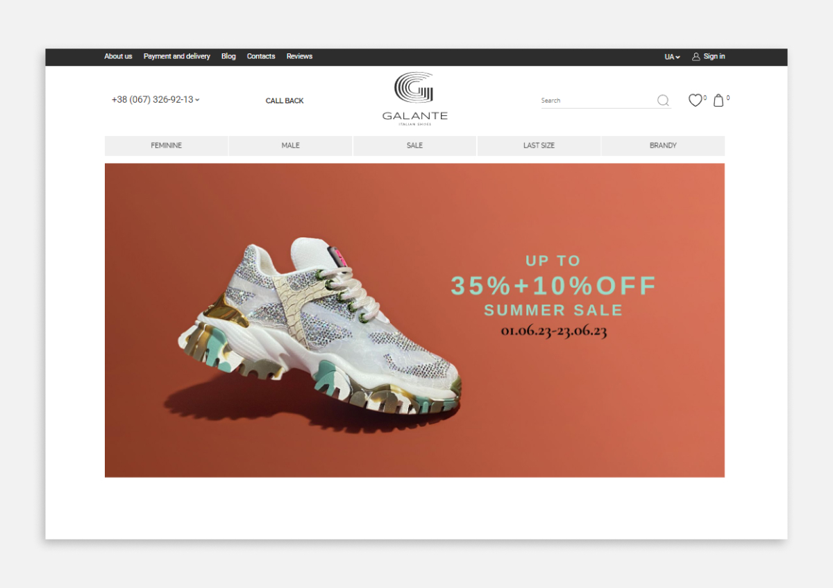
- Limited offer. "25% off until next Friday" really works. So do limited offers with bonuses for the same price, and simply selling small quantities of goods. It's an almost universal CTA, but it shouldn't be used all the time — only during seasonal sales, and even less often. Otherwise, your strategy will be quickly figured out and your loyalty and reputation will suffer more than you will earn.
- Convincing with facts. If you have something to brag about, use it. Show how the number of satisfied users is growing, what success your other clients have achieved, and so on. Of course, if these are real figures.
Is it possible to be creative with calls to action? Of course, you can! If you follow two CTA rules. When you come up with a call to action, for example, "Keep warm!" for your electric fireplace company, show it to the entire office, a bar student, and Aunt Emily from the second flat. If 95% of the respondents understand the idea, you can launch the campaign.
Design: Catchy, Concise, and Clickable
The critical rule of CTA design is that the call-to-action should stand out from the rest.
The second rule, which is no longer so binding, is that buttons work better than images and links. This is due to the habits of users who think click = button. Various studies show that the effectiveness of a classic button will be 30-50% higher.
To make your call to action effective, you need to work out the following points:
- Colour. The shade should make the button stand out on the screen in general and against the banner background in particular. Designers will select the best options based on your brand's corporate colours. Shades of red and green are still considered basic, but if you have a website in beige, for example, it will look out of place. The button can even be black, the main thing is harmony and contrast.
- Size. Bigger is better, because it's more noticeable and because it holds more text. And it's especially good for mobile devices. Simply because such buttons are easy to reach.
- Animation. Moving elements attract attention, as well as flashing ones and so on. If you are not running an online casino and the task is not to confuse the user but to help him or her, you should limit yourself to small animations. Even a simple change of colour of a button on hover works well.

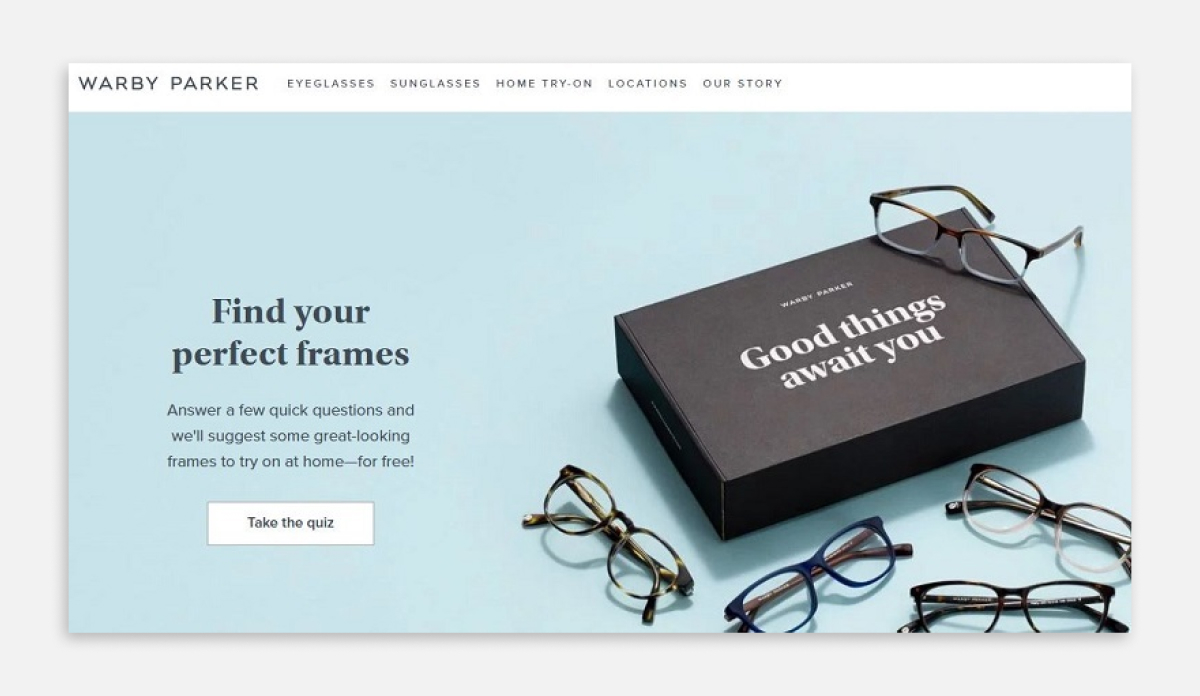
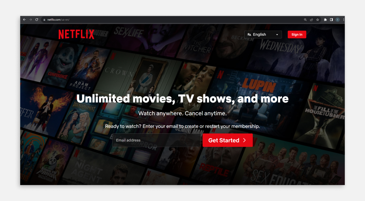
- The environment. A good call-to-action is a very capacious idea. A headline, a small explanation, and the button itself. To focus attention on them, you need not only to choose a colour, but also to leave as much space around them as possible so that nothing distracts. A frame and a clean background are already good. You can add an image to the free space, for example, a photo of a person looking at the CTA, an arrow, or something else.
Placement: Prominent and Relevant
Place the call-to-action where it is visible:
- Above. The best universal place is above the fold, above the fold line, or, more simply, on the first screen. This is where visitors look at 80% of the time. Moreover, Hero Image, the first large ad banner in the slideshow collection, garners 84% of clicks.
- Below. The exception to this rule is complex offers that involve significant costs. In such cases, it's better to guide the client through the entire funnel, telling them in detail about the project's features, and add a CTA at the end.
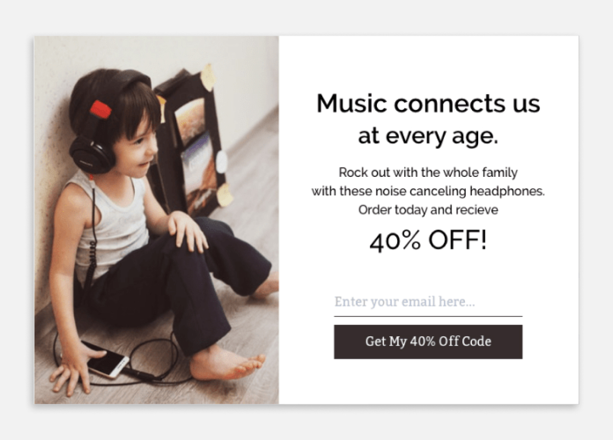
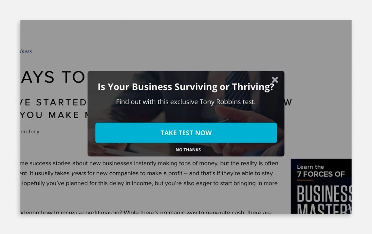
- Everywhere. Where else? For example, on pop-ups. Yes, they are not very popular with users, but if you follow the rules above and launch them not on the first screen, but at a certain viewing depth, they work great. When exactly? It depends on what you offer.
On the banner itself, it is recommended to place the button in the upper left or lower right corner, according to the viewing patterns of the screens. Moreover, the second option works better for mobile devices because most users are right-handed.
By the way, you can place several call-to-actions at once, not only at the top and bottom, but also on the same screen. The second option will work if you have written different calls-to-action and figured out where to place them. For example, in addition to the main banner with the main message "Try the service for free", you can add a "Register" button at the top and a link to a promotional offer at the bottom.
Conclusions: What Is Important for an Effective CTA
For a call to action to work, you need to write the text, think over the design, and choose a place to place it. You can make it effective by taking into account your business area, needs, and customer characteristics.
Personalized call-to-actions formulated in the first person work best. Especially if they clearly describe the offer with a price or the word "free". Buttons have a higher conversion rate than images and links, and the banner itself should be as concise as possible.
There is no universal text and design for CTAs. The best solution is to apply the best practices, taking into account the specifics of your business. And then analyse the results, build hypotheses, run tests, and change various elements of the call-to-action until you get the perfect result.
